Apple has been at the forefront for some of the biggest and best technology for the world. However, they have now introduced a new streamline of service outside of the traditional apple devices. They have made many of their users content with apple pay and having a digital way to pay. However Apple is now going full force in by having its own credit card, the Apple Card. While there are a lot of features introduced with the card, we wanted to focus on three key points that make the card special and allows for an amazing user experience.
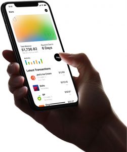
- Apple Card is integrated with Apple Maps to pinpoint where exactly you bought something. By doing so, Apple makes it easy to see the store name and other details about a transaction. Making the experience enjoyable and easier to use a banking app because one does not have to guess what the long number on transactions mean.
- Apple is also adopting a ring system to help mange one’s balance and control how much interest you pay. By this, the total balance will be in the middle of the interactive ring, one then scrolls through that ring to see how much interest you’d be charged based on how much of your balance you pay. This makes for a an easier UX and makes it paying very clear for users. Thus enhancing the user experience for how productive and simple it is to use, especially when comparing to other bank apps that do not have a feature like this.
- Apple Card also works with Apple cash to give users immediate cash back to use instantly. They have been able to integrate to systems, eliminating the need for multiple accounts and platforms. This creates efficiency and has an easy to use integration feature allowing for users to enjoy using the app.
Excited for the Apple Card? It is set to be released this summer, but there is no official release date. One thing is for sure, Apple made it apparent that their user’s experience with the app is a priority.
