User experience design agencies may have become experts in industry-related needs. With these needs, come the thought of transforming all elements and consider them as a need to make everything convenient for the users. The search bar has become a key element that empowers a brand in terms of its app and site, as it paves the way for consumers to instantly look for the things they need.
Let us take a look on some of the major considerations and hacks that most UI / UX design companies do in order to make some features compatible with the users’ needs.
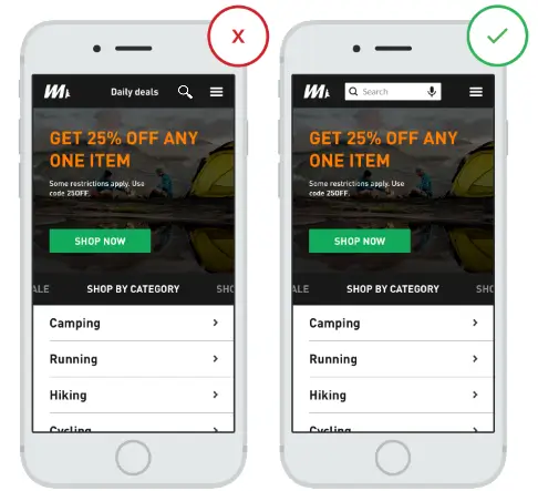
1. Visibly highlight the search box
The most important principle of the search box design is to make it eye-catching. Search bar has always been an important feature in your website or app, thus, it should be placed in the most visible position because it is the quickest way for users to find content. With this one secret of UX, users will be able to help themselves through with what they urgently need and look for them instantly. Also, the color of the search bar should always be in contrast with the navigation bar of the page.
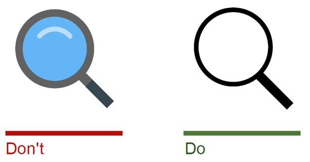
2. The search box works with the magnifying glass icon.
Icon is understood from its meaning as a visual symbol or representation of something, either a behavior, or idea. There are only few identifiable icons that are universally recognizable, and the magnifier is one of them. Even without extra copy or tag, users will automatically know that the magnifier represents “search”.
3. Place the search box at the user’s expected location
Debates have aroused over time, about where to place the search box on a web page that consistently helps users find things. A lot of well-known websites such as YouTube, Amazon, IMDB, and BEST BUY place the search box at the top center or at the top of the right side. A. Dawn Shaikh and Keisi Lenz made a survey on 142 people. They summarized the user’s expected search box location in a chart. The study found out that the upper left or upper right corner of the page is the easiest place for users to notice. Using this type of F-type visual browsing, users can easily find the search box. Placing it in a location that is not within the user’s expectations means that the user needs to pay extra attention to find the search box. It may take them few seconds, which is quite contrast to the convenience goal of every developer.
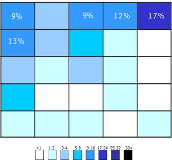
The user will first find the search box in the upper right corner of the page. If they don’t found the box, they will start browsing the top of the page.
4. Provide a search button.
Although clicking the keyboard enter key can trigger the search, some users are still willing to use the traditional “(search) submit” button. Having a button will also make the user aware that the original triggering search action still requires an additional step, even if this step is to press Enter.

5. Tell users what they can search for.

The description of placing a search query within the search box is an ideal move to help out users with their needs. This tells the user what kind of content, category, or item can be searched for. If the user can search for many types of content, the search input prompt is more important. However, search input prompts must limit the number of words, otherwise it will increase the user’s cognitive burden.
The placeholder copy prompts users for what they can search for.

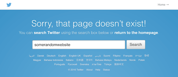
6. Ideally, each page must have a search box.
Tucker FiztGerald emphasizes the importance of the user being able to use the search box on every page. The search box is especially needed when the user cannot find what they want, especially when there are 404 pages.
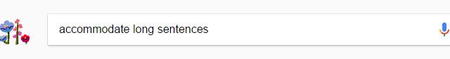
7. Consider the right size to accommodate long queries.
It is a common problem for UI designers today to design input boxes which are too small. It is true that even with a short input box, users can still type in long search copy, but this will cause only a part of the long copy to be visible. This will result to users not reviewing or editing the entire copy conveniently. This user experience is not humanized. In most cases, if the search box is too short, users will tend to enter short and inaccurate search copy files due to the poor readability of long text files. If the size of the input box can be defined according to the user’s expected input copy, then it will be better in terms of readability and display experience. According to experience, the ideal input box of a search bar has to display 27 letters.
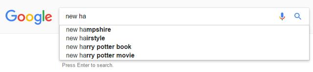
8. Use smart recommendation.
Smart matching can save users’ input costs. Designers often think that the smart matching mechanism aims to increase the speed of user input, but it is actually more effective in helping users organize search languages. Ordinary users are not very good at organizing search languages. In this case, if they do not express clearly even from the start, then it is difficult to find suitable search results successfully. When smart matching works, it helps users express clear search questions.
All these tips and tricks all lead to how user experience will leverage each given time. Making these impressions towards clients’ consumers will help brands keep users in-tact to their choice of brands. UX / UI design companies are experts, even in the industries they serve, so better yet, partner with USER now to make convenience come to life!
