Government websites often meet visual-design, accessibility, and compliance standards, yet users still struggle to find information. As a leading UX design agency Singapore businesses and agencies trust, we consistently see that these failures are rarely caused by aesthetics alone. Instead, they stem from information-architecture problems. This article explains how this problem manifests, why it is commonly misdiagnosed, and what research shows about addressing it.

What Does “Struggling to Find Information” Mean?
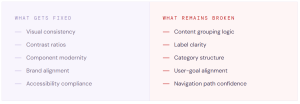
When users struggle to find information, the issue is often subtle. Rather than visible errors, formative and summative usability testing tends to reveal behaviors such as repeated scanning, hesitation, and abandonment. These behaviors indicate uncertainty about where information is located or which option will lead to the desired outcome. Importantly, these behaviors occur even when users understand how to use the interface.
Why This Problem Is Often Misdiagnosed
When users appear confused, teams frequently assume a visual-design problem. Common explanations include cluttered layouts or outdated styling. As a result, a UX design company might be hired to focus solely on improving visual clarity.
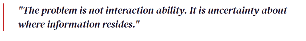
However, research shows that visual clarity and findability are different qualities. A website can look structured and consistent while still being difficult to navigate. Visual design can reduce surface-level friction, but it cannot resolve deeper structural issues.
What Usability Testing Reveals Instead
Testing shows that users often recognize navigation elements but still choose inefficient paths. This reflects weak cues about where information is located. When labels or categories do not clearly indicate what users will find, decision-making slows down. By conducting a focus group Singapore researchers can often identify these mental model mismatches before a single pixel is even designed.
Information Architecture as the Root Cause
Information architecture defines how content is organized, labeled, and structured. Research shows that problems arise when this structure reflects internal organizational logic instead of how users search for information.
Users expect content to align with their goals and mental models. Organizations, however, often structure content according to departments, policies, or ownership. This mismatch is a primary reason users struggle to locate information. Working with an experienced UX consultant can help bridge the gap between departmental policies and the user’s actual goals.
Why Visual Design Cannot Compensate for Structural Issues
Visual design improves readability and consistency, but it cannot compensate for unclear structure. Users rely on grouping and labels to navigate. If these are unclear, improving visual presentation alone will not improve task success.
Research shows that users make navigation decisions based on perceived relevance. If structure and labeling do not align with expectations, users will continue to choose incorrect paths regardless of how refined the interface looks.
Methodology (How These Findings Were Identified)
The observations summarized in this article are based on established UX research methods and recurring patterns seen across multiple systems.
- Moderated formative and summative usability testing with real tasks.
- Focus group discussion Singapore sessions to evaluate content labeling.
- Evaluation of content structure against user expectations.
These methods are widely used to identify navigation and findability issues.
Why This Matters in Government and Enterprise Systems
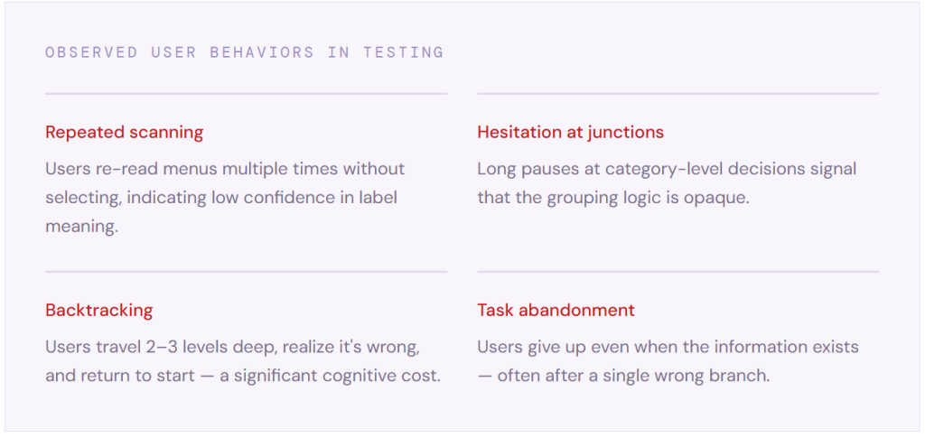
Findability issues have significant impact in complex, public‑facing systems. When users cannot locate information efficiently, support demand increases, users rely on workarounds, and confidence in the system decreases.
Addressing a Structural Problem
Improving findability requires changes to structure, not just appearance. Effective approaches include:
- Organizing content based on user expectations
- Grouping information around tasks and goals
- Using clear, familiar language
- Prioritizing commonly used pathways
These changes align the system with how users naturally search for information.
Conclusion
Good user experience is not only about visual clarity. It is about structural clarity. Systems perform better when information is easy to find, recognize, and act on. In complex environments, information architecture plays a critical role in making that possible.
Want to Discuss This Further?
If users are struggling to find information on your system, it may indicate a deeper structural issue worth exploring.
Email: project@user.com.sg
Contact page: https://www.user.com.sg/contact-user/
