Our daily lives are always faced with countless choices. Especially in our professional career, we must consider many oppositions and challenges. Better design solutions are based not only on recommendations but also on the basis of facts, experience and knowledge. Today we are talking about a UI designer often encountered in the work of a project: for the user interface which color scheme is better, light or dark?
First, the factors that affect the choice of color scheme
To be sure, there is no single choice to achieve all the goals. The solution is closely related to many factors, including not only the user, but also business goals, market conditions, and current design trends. Let’s take a look at some of the important factors designers must consider on this issue.
1. Readability and readability
These terms are directly related to the feelings that the text content brings to the user:
Readability defines how easy it is for people to read words, phrases, and blocks of text; legibility measures how quickly and intuitively a user recognizes letters in a particular font.
You should carefully consider readability, especially for interfaces that have a large amount of textual content. Among the many factors, the user’s perception of the effectiveness of this article, for the interface to choose a color scheme plays a crucial role.
For example, for a physics object that is perceived in different contexts, black text on a white or light background seems to be larger than white text on a black background. The poor readability leads to a bad user experience: Users can not only not read the information, but even worse is that even if the information is related, it can not be read smoothly, so that the user feels the text brings to their own inexplicable tension, and ultimately leads to the user missed key information.
Does this means that the interface with a bright background is easier to read? This is not always the case.
The famous user experience design master Jacob Nielsen mentioned:
Use high-contrast colors between the text and the background. The best readability requirements: black text on a white background (so-called positive text), or white text on a black background (so-called negative text). Although the contrast is the same as the positive text, the opposite color scheme will cause some deviations and slow the reading speed slightly. In the color scheme, legibility is more affected by a pure black background than a light background, especially when the background color is darker than pure white.
Therefore, if designers can figure out the textual perception of different background patterns and carefully study the choice of font, any color scheme can be highly readable.

However, some scientific studies as early as the 1980s showed that the heavy use of bright background text seems to be a more effective choice for most users.
D. Bauer and C.R. Cavonius shared their findings in the paper on how advertising vectors work, “Improving the readability of visual display elements through contrast inversion” (1980). In particular, they found that when reading the text, the participants increased their accuracy by 26% when they viewed the dark text on a light background.
Why is it so? Jason Harrison from the Sensory Perception and Interaction Research Group at the University of Lembria in the United Kingdom explains this phenomenon in the following way:
People with astigmatism (according to various data: approximately 50% of people) feel that text on a black background is more difficult to perceive than black text on a white background, which is related to light levels. On a bright display (white background), the iris will close slightly, reducing the effect of the “deformed” lens; on a dark display (black background), the iris will open and receive more light. Deformation of the lens can make the focal length of the eye more blurred.
Therefore, if there are a lot of text on the interface and the user needs to read for a long time, using a light background will make the user feel more friendly.
2. Accessibility
Accessibility is mainly defined as that WEB or mobile interface can be accessed by as many users as possible, and the provided functions are available to everyone without “functional discrimination.” Therefore, the decision to “use or not to use” must be based on the user’s needs and preferences rather than on their physical capabilities.
The color scheme is one of the main factors affecting this aspect. When choosing a palette and color combination, designers need to consider users of different ages, special needs, and disabilities. These users also influence the color selection of background and layout elements. In the designer’s in-depth understanding of the target user, the data obtained by the user’s research will be very helpful to their design decisions.
3. Sharpness
Sharpness defines the ability to view and distinguish all the core details on a screen or page. First of all, it is related to the simplicity and intuitiveness of navigation: you can browse layouts and find information areas and interactive elements. Users do not need much effort to find what they need. If the sharpness is not properly tested, it may result in a weaker visual hierarchy and make the screen become a mess.
The contrast plays an extremely important role here, and the color scheme becomes the basis for it. Check if the interface is clear and the contrast is high enough. When viewing the screen or page in fuzzy mode, don’t forget the good old trick of “fuzziness test”, and see if all the important things are easy to touch in the fuzzy state. Tatsu and obviously visible.

4. Responsiveness
The responsiveness of the interface means that users can use it normally regardless of the device. What looks stylish and appealing on a high-resolution professional monitor can become a dirty stain on a small, low-resolution screen.
Therefore, some color schemes that look beautiful at the design stage may lose their original beauty under various practical conditions.
Because color schemes directly affect color, shape, and text perception, tests should be performed on different devices before making a final decision.
5. Environment
In the context of careful study of the target audience, the use of WEB and mobile interfaces may be considered typical.
For example, when used continuously under natural light, a dark background will produce reflections, especially on the screens of tablets and smartphones. Conversely, in dimly lit environments, a dark background can keep light away from the screen, which has a great impact on navigation and readability.
Therefore, the problems of color combination, contrast and hue cause a great deal of attention here.
Second, the color scheme selection list
Taking into account the above mentioned factors, we provide a short list of the basic steps that should be followed when choosing a generic color scheme for the WEB or mobile interface.
1. Define the purpose of the interface
After determining the core points of the interface application and the ability to solve the problem, you can choose a color scheme more rationally.
If the UI is text-driven (a blog, news platform, e-reader, etc.), light-colored backgrounds tend to be a better choice. The light background makes the screen more breathable and spacious, and the user’s attention is more focused on the copy.
On the other hand, if the interface is visual content-centric, there are a large number of pictures and there is no text, then a color scheme with a dark or bright background may be a good choice, because the color of the image will be deeper, and it usually looks ordinary. The layout will become more fashionable and even “luxury.”
2. Analyze your target users
The definition and analysis of the target user is the first thing the designer should do. Knowing who your potential users are and what they expect from a website or application lays a solid foundation for designing a usable, useful, and attractive interface.
Middle-aged and older people tend to use light-colored interfaces because they feel that these interfaces are more intuitive and easier to navigate; young people tend to prefer better-looking interfaces, newer backgrounds, and more fashion, which can make Target users are involved; use light backgrounds and interesting details to attract young people and children.
Obviously, the choice of colors depends on the nature of the interface functions and content. However, if your strategy is user-centric, then the target user’s preference is an important basis for making design choices.
3. Research competition
Another aspect to remember is that your product will not appear in the Blue Ocean market. Therefore, it will gain wide attention from users in the fierce market competition.
The choice of color scheme is a way for an application or website to attract users’ attention. It will affect the user’s first impression of the application or website and whether or not the user will use it. Either take the time to research existing products or waste time redesigning ineffective solutions.
4. Test and test retest
The points described above are convincing for key things: Since colors are factors that directly affect interface usability and attractiveness, each design solution should be performed at different resolutions, screens, and conditions. Proper testing.
Testing reveals the advantages and disadvantages of the color scheme before the product goes to market. If the design solution is inefficient, the user is left with an amazing first impression.

Third, the compromise solution
Unwilling to follow strict color schemes, UI designers sometimes find compromise solutions.
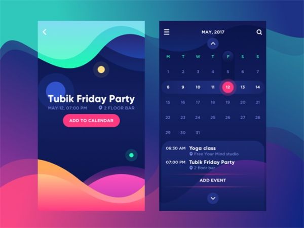
1. Dark interface, white label text
As we mentioned in the User Experience Design Trend Review: This trend is particularly popular in interfaces based on dark background scenarios. It also uses another method to achieve proper readability, which is often contentious: use a light background in the core information area.
The designer solved this problem by adding an elegant contrast to the screen or page. One case in point: The water tracking device designed by the Tubik team applies this principle.

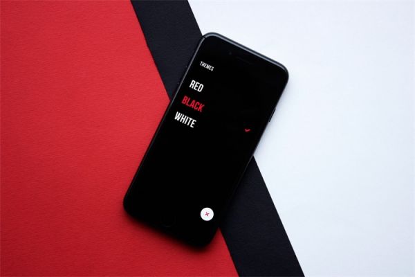
2. Provide users with the choice of color scheme

Another method is to let the user select the mode of the color scheme. The design we did for Upper was as follows: A task list application that provides users with a color scheme.
On the one hand, this approach is very user-friendly, not only based on the availability of the product, but also based on the user’s aesthetic preferences, making the user’s choice more personalized. On the other hand, designers and developers need to spend extra work time to make all plans.
